Tuesday, September 30, 2008
Motion Graphics
I really really really like this video. The typography used is great! It amazes me how everything in the video is type. I also like the music because it ties in with the type and enhances the message against pollution.
Book Jacket

Soul Cravings
by Erwin Raphael McManus
I absolutely love the book jacket for this book. Obviously the designer chose to use the power palette which captures the viewer. I love that it is so simple, but bold at the same time. The designer's use of asymmetry (obtained by using the fingerprint) really works well with the concept. Not only is the design great, but the book is also wonderful.
 Basically, it is about what everyone craves in life as well as answering the question of why we crave what we crave. Unfortunately I could not find a picture of the back cover of the book. It's incredible. It continues the red fingerprints but with the pointer through pinky fingers. Pick up a copy and check it out! For more great book covers by DogEaredDesign go to http://www.dogeareddesign.com/dogeared.html
CD Sleeve
"Absolution" by Muse


There's a lot I like about this CD sleeve. First, I love the rhythm created by the flying shadows of people. This carries from the front all the way to the back of the CD sleeve. I believe that these bodies flying over the people are imitating airplanes which reminds me of the beginnings of a war. I think it's good that the designers kept the typography and wording simple and let the images speak for themselves.


There's a lot I like about this CD sleeve. First, I love the rhythm created by the flying shadows of people. This carries from the front all the way to the back of the CD sleeve. I believe that these bodies flying over the people are imitating airplanes which reminds me of the beginnings of a war. I think it's good that the designers kept the typography and wording simple and let the images speak for themselves.
3 LOGOS
This logo is used for coffee drinks, snack bars, and many other coffee products. I for one love coffee and enjoy all of Caribou Coffee's products. The logo is really inviting to me because of its naturalistic, earthy feel. The typography used also adds to this naturalistic design and gives it a light and fun personality.

DC Shoe Co. USA
If you live in the US, you're probably very familiar with this logo. Used especially by skateboarders, DC shoes have become quite popular in our generation. I personally do not own a pair of DC's but I have always loved this design. I think it's awesome how the designer made the D and C overlap and become almost symmetrical with the openings. I also like how the star is added to give even more uniqueness and style. It's somewhat simple but reaches a wide range of viewers.

Life is good.
Now I know that I am not the only one out there that loves this logo. Not only do I love the logo, but I own many of the products. What I like most about this logo is the typography used. The type is simple, playful, and inviting. I also like the animated characters used with the type (like the little man on this logo). Whether the character is a dog, person, boat, or flower, they are made to be unified with the type.
Monday, September 1, 2008
Top 5 Designers

Gerard Huerta
Gerard Huerta is one of my favorite graphic designers. His unique designs have made their marks on many well-known companies and businesses. Nabisco, Swiss Army, Spelling Entertainment Inc., and even Ringling Bros. an
 Huerta designs range from the Superbowl XXVIII to Clip Art.
Joe Finocchiaro
Another designer I like is Joe Finocchiaro. Finocchiaro has
 impacted the world of design quite significantly. Some of his works include symbols for Fraser Papers, Dodge, Samsung, American Heart Association, PBS, and Compaq. I particularly like the Fraser Papers Design. Although it is simple, the continuity and angle used to combine the two beginning letters, "F" and "P", is very creative. In fact, most of his designs are quite simple, but the creativity and craftsmanship involved makes a notable impact on viewers. His designs are so trusted that they even appear on the American Express Card. Joe Finocchiaro inspires me to become a great designer who creates interesting logos and symbols but also greatly considers craftsmanship.
Saul Bass
Saul Bass is also a great designer. Bass designed logos, movie posters, title sequences, and many other items. Some of his greatest accomplishments in the movie industry were designing the posters for "Vertigo", "The Man with the Golden Arm", and the "Two of us". He also created the title sequences for the movies "Cape Fear" and "Good Fellas". His most popular logos, or company identities, include United Airlines, AT&T, and Minolta. Although some of his creations may seem old, Saul Bass is seen as a legend. In a way, he helped open the door for the design industry. I really like how he created something new and interesting for that time period. I like his style in that many of his designs look like paper cutouts. Saul Bass passed away in 1996, but his work still lives on.
Paul Rand

When speaking of graphic design, of course Paul Rand's name is going to be brought up in the conversation. Paul Rand is responsible for designing logos for many of America's important institutions. These institutions include UPS, IBM, ABC, NeXT Computer, and Westinghouse. He also created many classic short videos. The way he used space and shapes has set an example for all graphic designers. I particularly like his designs for
 IBM. I love that he originally created the logo using an eye, bee,and "M". It later became the blue, striped IBM logo that we recognize today. This goes to show that our designs can always be changed, or updated without losing meaning or effect. Paul Rand also passed away in 1996, but he is still considered a legend.
Milton Glaser
Milton Glaser is also a well-known graphic designer. One his greatest accomplishment
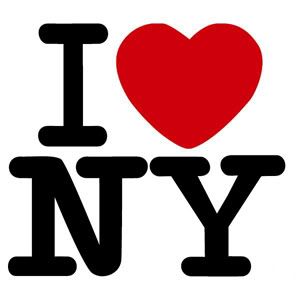 s was the trademark "I love New York". I like that this design uses the power palette. This design has been used thousands of times and has been altered to fit other places as well. Although the design is simple and short, it remains timeless in America. Other design accomplishments of Glaser's are Barron's (a book publisher),Tomato Record Company, and ISIX. He also designed covers for Time Magazine, Fortune, New York Magazine, and Washington Post. Another thing I like about Glaser is that not only he a great designer, he is also a great artist. He drew pictures for the book "The Alphazeds" and a series based on Claude Monet.
Subscribe to:
Posts (Atom)