Saturday, September 11, 2010
Well today was kinda a fail...
Well I woke up fully hoping to go out and photograph some people for my project. I did have a camera ready but then its owner ended up needing it...so...I was not able to go out. It also was pretty rainy today in Gville so that effected my plans as well. Hopefully I can find some time to go out and do some shoots before Tuesday...but on the bright side...I did get a chance to research some more photographers and really enjoyed some biographies on Dorothea Lange. Since a lot of her work was about capturing the very natural essence of individuals, I was very intrigued. Also I found the works of Robert Doisneau to be very inspiring because many of them capture the lives of everyday people in France. I liked the somewhat playful atmosphere of his photos. Here's a link to a video if you'd like to check some of his photos out. I also found another video where a guy is giving street photographers tips on how to interact with their subjects in a natural way and how to capture interesting elements of daily life.

Saturday, September 4, 2010
Photo Research
So after more thought and research, I've decided to go in more of a spiritual direction for my project...I am really interested in seeing people's spiritual beliefs and learning where they come from. I became really interested in this after living in New York over the summer. New York is
soooo diverse and I loved hearing people's stories and how they ended up there. To continue, I hope to start my project off by asking people where they're from, what they do- and then tell them I'm doing a photography project in which I hope to get to know them better and their spiritual beliefs. I really want to make sure that I open up in a way that is will not take sides or offend anyone. I really believe this question could open up great conversations and really shed a lot of light on their past and their personalities. After conversation, I'll ask them if I can tak
e their pictures for my project. So- these are the basics of my project so far, and I will probably add on as I go. Right now I am debating how to photograph my subjects- should I keep a consistent background such as putting up a white sheet or should I just photograph them in their natural habitat? I also am debating whether to photograph my subjects in black and white, color, or muted tones?
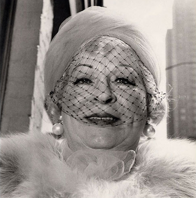
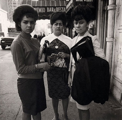
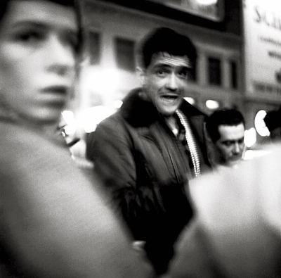


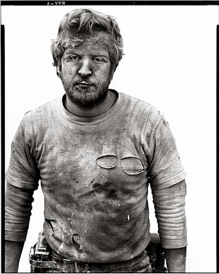
Here's some pictures I've looked at from Amy Arbus, Dianne Arbus, and Richard Avedon's collections:


Wednesday, August 25, 2010
Community Photography Project
For my photography project this semester, I really want to do something that will not only mean something to the community, but also myself. Right now I am planning on going out in different communities within the Greenville and Anderson areas to interview and photograph people of all ages, races, gender, and cultures. My hope is that by doing this project, certain stereotypes will be confronted and examined.


As far as my photography style for this project, I have been studying the works of Amy Arbus and Richard Avedon. Som
ething that has really influenced my style is the way these two photographers had groups of photos in which they captured life in the raw. The people they focused on were not models, but just average, everyday people.
With this project I really want to connect with my subjects and find ways to really see into their hearts and souls and also capture that on film. To open up the conversation floor, I've been brainstorming some questions I could ask my subjects. Here's some I've thought of so far:
1. Where are you from originally?
2. How did you arrive here?
3. What's the best thing that's ever happened to you?
4. What's the hardest thing you've ever been through?
5. What would you do if you won the lottery?
6. If you could change the past, what would you take back?
7. Who do you admire most in your life and why?
8. If you could do anything or go anywhere, where would you go and what would you do?
9. What is your biggest goal in life?
10. Can you think of a time where you have ever felt defeated or disappointed?
Tuesday, September 29, 2009
Woodtype Letterpress


In addtion to these amazing pieces, you can visit Green Chair Press for more prints and creative letterpress ideas.
Tuesday, February 3, 2009


Paula Scher
Paula Scher is one of the most influential female graphic designers in all design history. Not only has she impacted the graphic design industry, but her paintings and drawings have also left impressions on the world. Paula Scher began her design journey by attending the Tyler School of Art in Philadelphia. In the 1970s she began her career by becoming an Art Director for record covers at CBS and Atlantic Records. From this point on her career soared. In 1984 she co-founded and designed for Koppel & Scher in New York. After seven years there she joined Pentagram Design, a famous and successful design industry. There, Scher defined her unique style by designing for companies such as The New York Times Magazine, The Public Theater, Sony, and numerous others. Not only is she an accomplished designer but also has taught 17 years at the School of Visual Arts in New York. Scher continues designing in New York and frequently writes articles for design magazines such as AIGA Journal of Graphic Design.
In 2001, Scher designed for the "Nouveau Salon des Cent" portfolio in honor of the notorious designer, Henri de Toulouse-Lautrec (1901-2001). This unique piece (Piece 1) uses a smooth serif typeface which is strategically designed to flow and move throughout the piece while maintaining structure. Here, Scher is imitating Toulouse-Lautrec’s art nouveau style with the illustrated woman’s legs and the movement of the text. Scher’s strokes are unevenly weighted throughout the piece to improve readability and form the image of a woman dancing. The kerning and tracking used throughout this piece varies also due to the movement of the text. The text near the top of the piece appears tighter than the text which composes the skirt. By utilizing these techniques and typeface, Scher accurately conveys the classic art nouveau feel. I believe typeface she chose was perfect for this piece because it corresponded with art nouveau style and gave me the sense of classic art of the 1890s. This typeface, which is relatively versatile, also creates the structure and unity needed for this piece to be a success. When looking at Scher’s works, it is clear that this typeface was only chosen to match the era not because of her personal taste. Scher tends to gravitate toward Gothic, sans serif typefaces. However this typeface could be almost limitlessly used to communicate clear messages in a print medium for various organizations.
Paula Scher has left a significant mark on New York by designing posters for a variety of companies. Among these posters are those for The Public Theater. In 1994 Paula designed posters for the productions, “Guess Who” and “Jenifer Lewis’s one woman show” (Piece 2 and 3). These posters were considered a pivot point for theater posters by using symbolism to suggest the theme of the play. More specifically, in the poster designed for the Jenifer Lewis play, Scher uses a shocking but cohesive color palette of a yellow background with a blue woman’s face. The typeface is equally as entertaining. This stretched, bold, Gothic, sans serif typeface is slanted with varied stroke weights to create a visual hierarchy and easy readability yet adds motion. Scher chose to use tight kerning, tracking, and leading for her typeface which gives this lively piece a sense of organization for the viewer. The typeface used is very straightforward and readable so that the viewer is not tempted to look away because of his or her lack of symbolic understanding. This style and typeface used definitely made me feel like I was back to the 90’s. This typeface is particularly useful when a designer wants to show movement and grab the audience’s attention since its size becomes increasingly larger as it branches toward the viewer. It would be best utilized for print and digital environment designs.
As mentioned earlier, Scher does not limit herself to digital design. She is also an acclaimed painter. Her recent works are of maps of the world where she has used type to compose the shape of places while also naming countries, cities, streets…etc. In her piece titled Tsunami (Piece 4), it is clear that her choice of typeface was crucial for the success of the piece. Instead of the formal, neat typefaces Scher used earlier in her designs, she decided to use her own hand painted typeface to convey an organic tone to the viewer. This sans serif, bold, stubby, Gothic typeface varies throughout the entire painting. In some areas the lines of text are kerned, leaded, and tracked tightly while in other places the text seems to loosely branch across the continents. I’m sure the viewer would agree with me that because of the typeface she chose, the piece leaves a very aesthetically pleasing impression. This typeface is also unique in that it unifies the countries, but at the same time distinguishes them each from each other due to kerning, stroke widths, tracking, and color used. This typeface would best be utilized for print because of the scanning involved but could also be creatively used for internet sites for companies which would like to incorporate an interesting and natural touch.
Last year in 2008, Scher designed a poster for The Public Theater advertising Hamlet (Piece 5). I added this piece to particularly demonstrate the grid-like structure Scher uses with her type to create order in spite of the uncomfortable symbol of a skull. She used a bold, Gothic, sans serif typeface with consistent, tight kerning and leading to add to this order. To create visual hierarchy amongst the text, she greatly increased the stroke lengths of the title of the play and thinned the strokes on the text involving details. When I look at this piece I am uneasy because of the skull, but then the typeface stabilizes the piece. This typeface could serve a multitude of purposes whether it be promoting a company or organizing information for an event. This typeface and structure could be used for environmental, digital, print (such as magazines and flyers), and motion designs.
Overall, each of these pieces demonstrate Paula Scher’s ability to encompass numerous styles and typefaces in order to clearly express the content of her pieces. Over the years her typefaces have evolved to clearly distinguish her pieces from the rest of the design world. Whether it is her neat, bold, Gothic, san serif type or her hand-made, painted typeface, Scher’s style is evident. Due to her distinctive designs and beautiful typefaces, Paula Scher’s work will always be known for its uniqueness, boldness, and versatility.
Monday, January 12, 2009
The House Industries
 The House Industries has significantly impacted the typefaces world. Their typefaces can be found everywhere! Whether it be cards for Birthdays, billboards, or logos, The House Industries designs it all. They have anything from neat and elegant typefaces to those that are rough and artsy. Since they have such a variety of typefaces, it leads me to believe that they are educated and experienced which is why I chose them as one of my favorite type foundries. The typefaces i enjoy the most falls along the rough typeface category and is called Soiled.
Subscribe to:
Posts (Atom)